
Dotplots are an extremely useful way of visualizing comparisons of small and large DNA sequences (as well as protein sequences), providing insight into the degree of similarity, deletions, insertions and direct and indirect repeats. In a dotplot, each nucleotide, or small window of nucleotides, of one sequence is compared with every nucleotide of a second sequence. Dotplots can quickly provide an overview of the relationship between sequences.
The Dotter program [1] has several very useful features including the ability to save and reload dotplots, the ability to zoom into particular regions of the plot, an option to create a multi-dotplot by aligning more than two DNA (or protein) sequences and permitting users to adjust the stringency of the matrix being displayed in real-time by changing the greyscale of the dots.
JDotter [2] provides an easy to use Java (platform independent) interface to Dotter giving all the benefits of Dotter in a single web-accessible tool. You can access JDotter here.
Additional background information on nucleic acid dotplots is available.
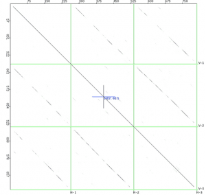
The first figure is a dotplot of three poxvirus interferon gamma binding proteins plotted against each other. Genes are displayed along the axes. This plot takes a few seconds to calculate.
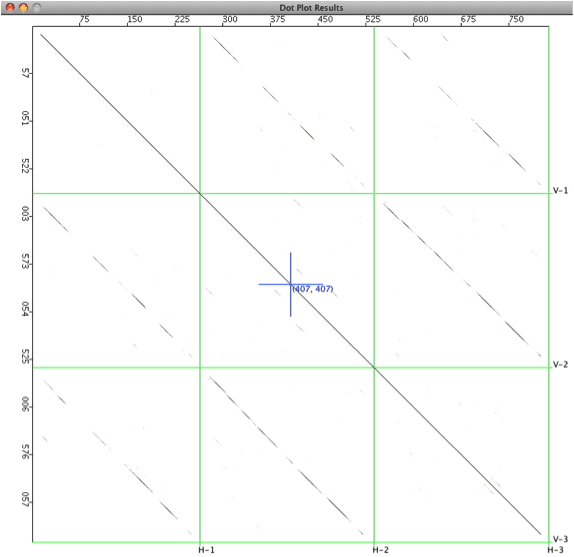

Here is a dotplot of vaccinia CVA and MVA genomes (~170 kb). Large deletions are present in MVA, a result of >500 passages in chicken embryo fibroblasts. Terminal inverted repeat sequences are obvious in the bottom-left and top-right corners of the plot. A plot for these sequences takes ~ 10 min to calculate.
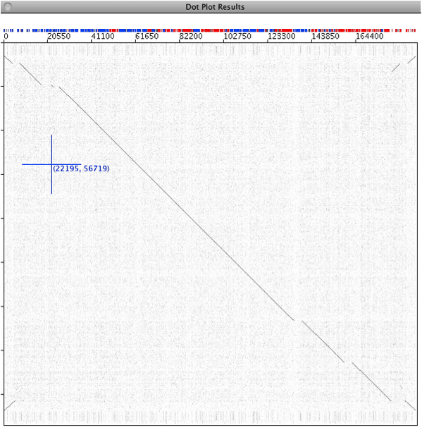

Next is a self plot of the Molluscum contagiosum virus genome. Enhancing background shows that it€™s not totally random. The stripes are caused by segments of DNA with different nucleotide composition. The region that creates the area in the red box has a higher A+T%, and appears to be derived from host sequences: it contains virulence genes.
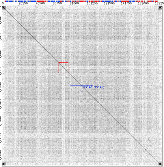

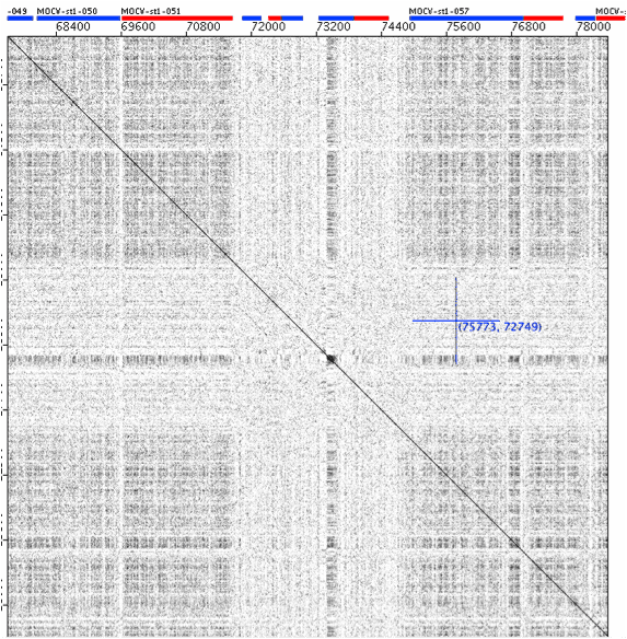
Another view of the Molluscum contagiosum virus genome self plot €“ a zoomed-in view of the red box shown in the previous figure. Three of the genes in the pale stripe appear to be paralogs, probably resulting from duplications of an ancestral gene acquired from the host [3].

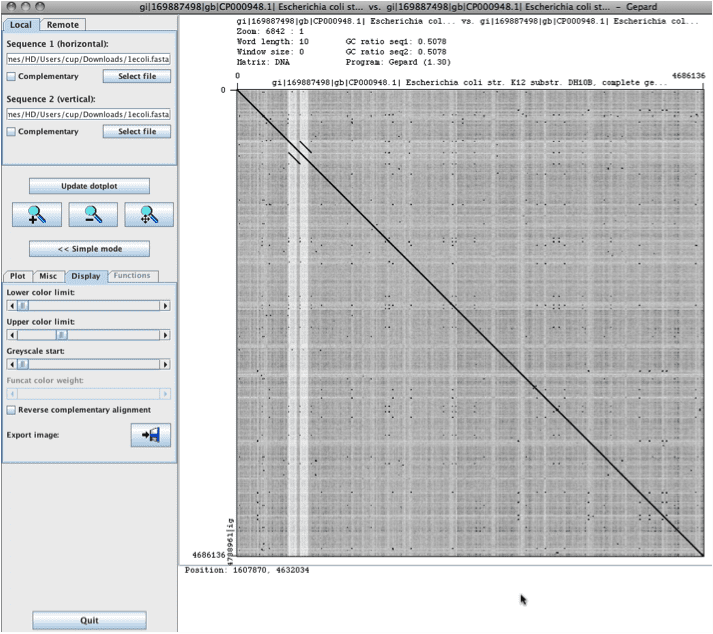
A student pointed me to the Gepard dotplot program, which is more suited for large DNA sequences (Gepard: German, “cheetah”, Backronym for “GEnome PAir – Rapid Dotter”). The self-plot below, for an E. coli genome took only a couple of minutes to complete. Although it uses a different type of algorithm, the features are similar to Dotter. It is simple to zoom into regions and you can change the parameters for scoring on-the-fly (post-plot).
1. Sonnhammer EL, Durbin R: A dot-matrix program with dynamic threshold control suited for genomic DNA and protein sequence analysis. Gene 1995, 167:GC1-10.
2. Brodie R, Roper RL, Upton C: JDotter: a Java interface to multiple dotplots generated by dotter. Bioinformatics 2004, 20:279-281.
3. Da Silva M, Upton C: Host-derived pathogenicity islands in poxviruses. Virol. J 2005, 2:30.
4. Krumsiek J, Arnold R, Rattei T. Gepard: A rapid and sensitive tool for creating dotplots on genome scale. Bioinformatics 2007; 23(8): 1026-8. PMID: 17309896

Comments are closed.